
Home Page Redesign
Company
Enthuziastic
Role
UI/UX (Product) Designer
Platform
All
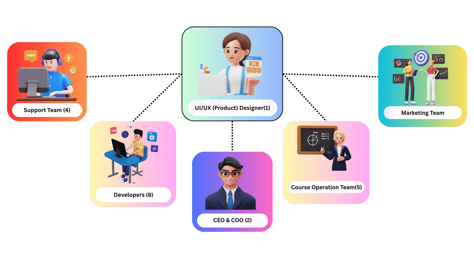
Design Team Size
1
Responsibility
From Scratch to Final UI till it Implement
Tools Used
Figma
The Problems
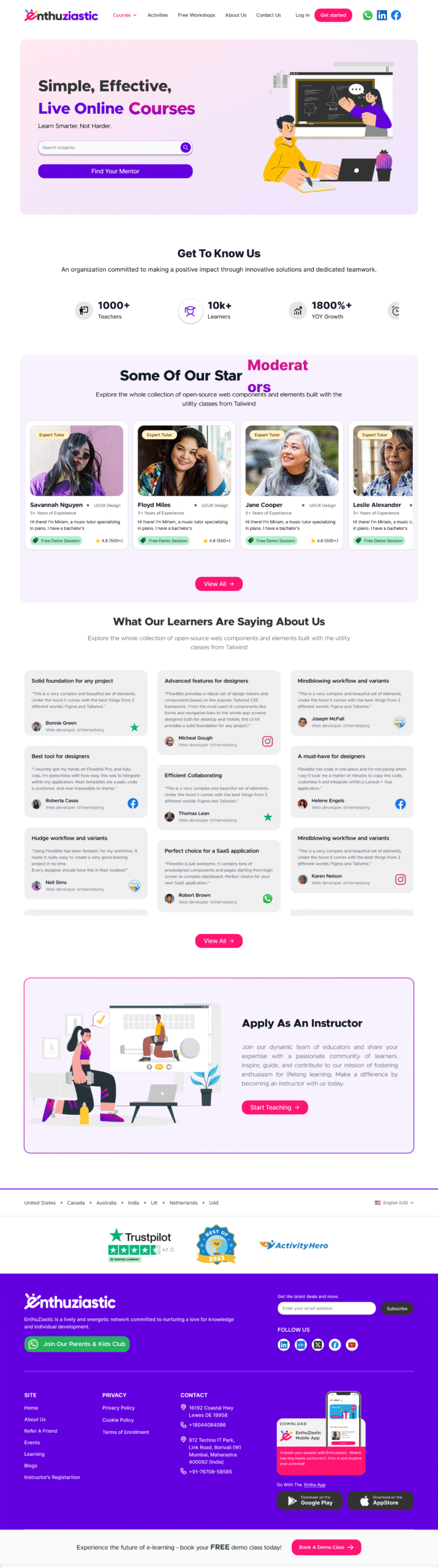
The EnthuZiastic homepage had:
- Inconsistent branding: mixed typography, unclear CTAs.
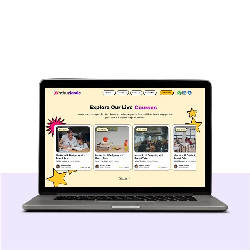
- Low visual hierarchy: key sections like mentors, courses, and testimonials lacked structure.
- Repetitive content: duplicate tutor bios and course cards.
- Weak mobile responsiveness : text overflow, misaligned elements.
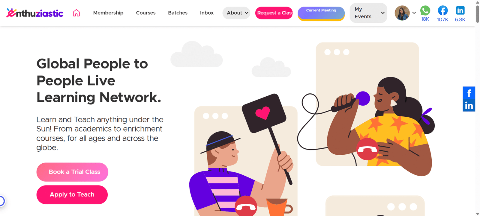
Previous Home Page
The Team
I led the design solo, collaborating closely with CEO, Developers, Marketing team, Course operation team, and Support team It was a tight, agile setup that enabled quick iterations and seamless execution.
The Process
I followed a user-centered design thinking process, focusing on understanding users’ pain points and business needs. My goal was to create a solution that balanced usability, business value, and technical feasibility through continuous feedback loops and iteration.
Key Steps
1. Stakeholder Interviews: I engaged with CEO, Developers, Sales and Marketing team to understand business objectives, user expectations, and technical limitations.
2. UX Research & Analysis: Identified user pain points and business goals through stakeholder, Sales team, Operation team's input and marketing team interviews.
- Users felt difficulty in finding mentors/courses due to cluttered layout.
- There was a lack of trust signals beyond generic testimonials.
- There was poor readability in some sections.
- Competitor Benchmarking: I studied platforms like Preply, Wiingy, Udemy, and Coursera.
- User Surveys: Found learners prioritize mentor credibility, course variety, and affordability.
- Heuristic Evaluation: Identified UI inconsistencies (e.g., mismatched buttons, unclear navigation).
- Weak mobile responsiveness: text overflow, misaligned elements.
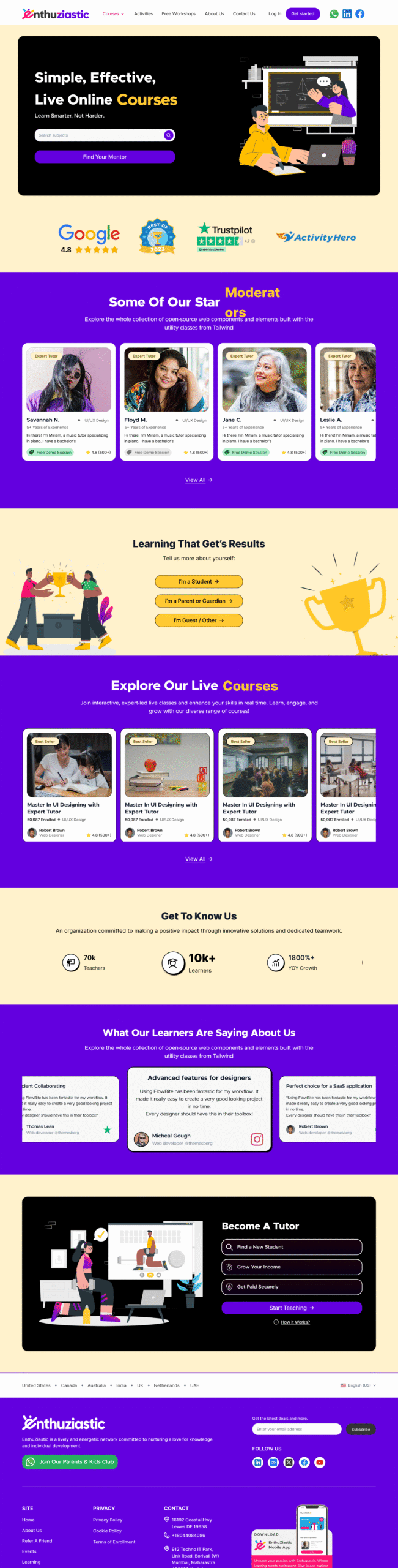
3. Defining UX Goals (Set Clear Objectives): Based on UX research including stakeholder's input, team interviews, competitor benchmarking, user surveys, and heuristic evaluations, I identified the need to reposition the homepage experience to be teacher-centric rather than course-centric.
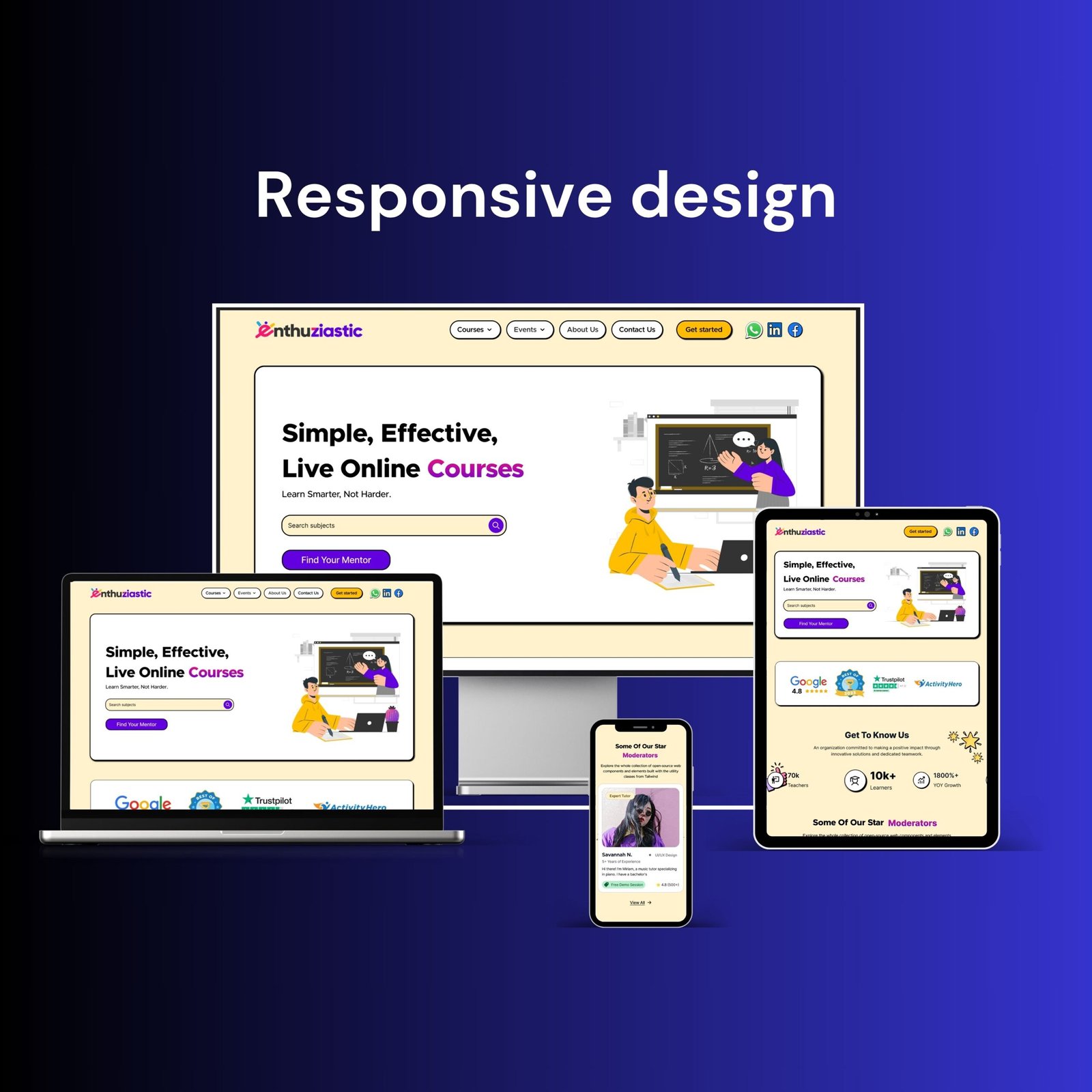
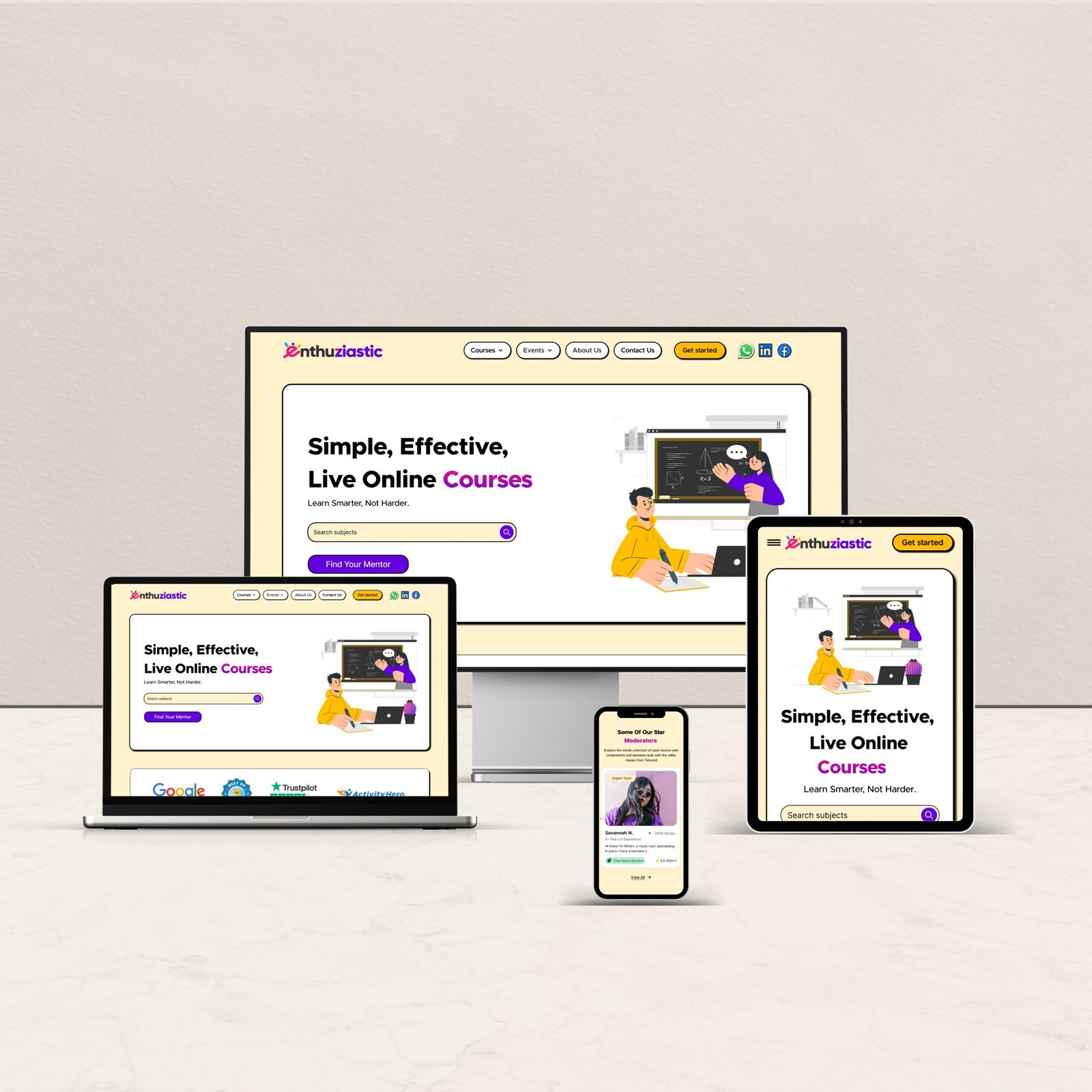
- Ensure Consistent, Accessible Design Across Devices
- Improve Discoverability & Navigation
- Build Credibility with Authentic Trust Signals
- Drive Engagement and Conversions
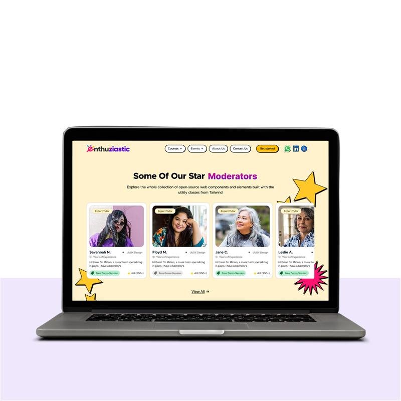
- Make the Experience Mentor-First because users prioritize mentor trust and teaching approach over course titles, as revealed in surveys, so the goal was to position mentors as the primary point of trust and discovery.
4. Design & Iteration: Developed wireframes and designed a clean, engaging interface that is aligned with brand guidelines. Created interactive prototypes, refining designs based on continuous feedback using Figma.
5. Handoff & Implementation Support: I delivered developer-ready specifications.
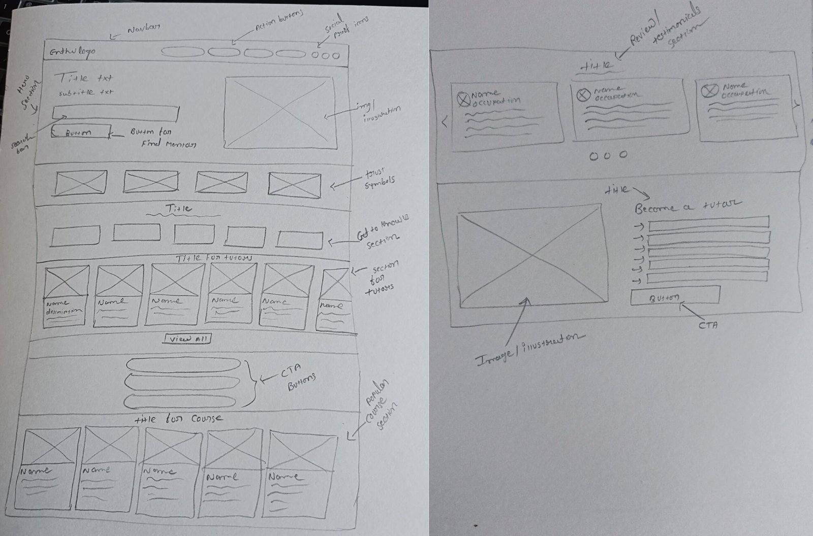
Wireframing (Sketching)
User Testing & Iterations
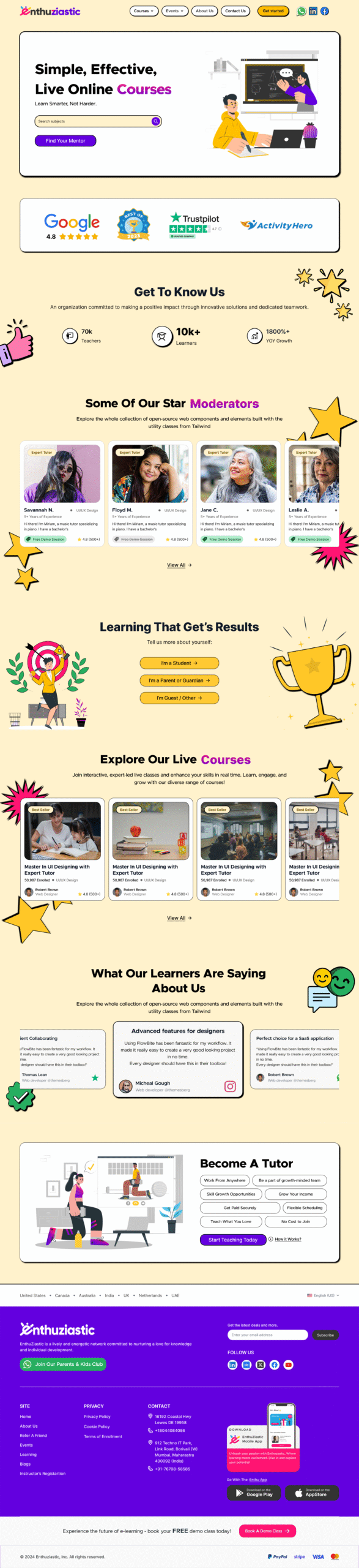
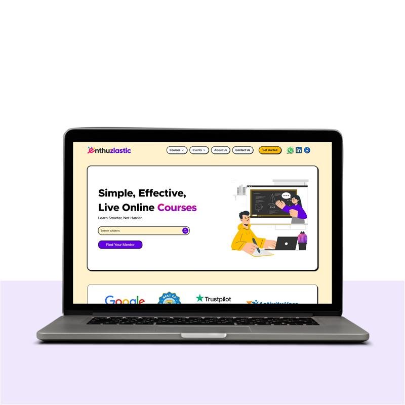
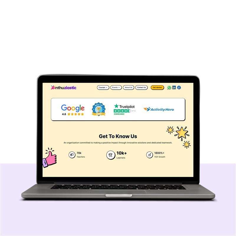
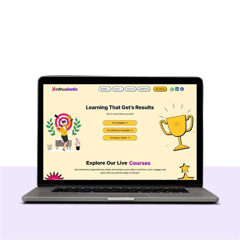
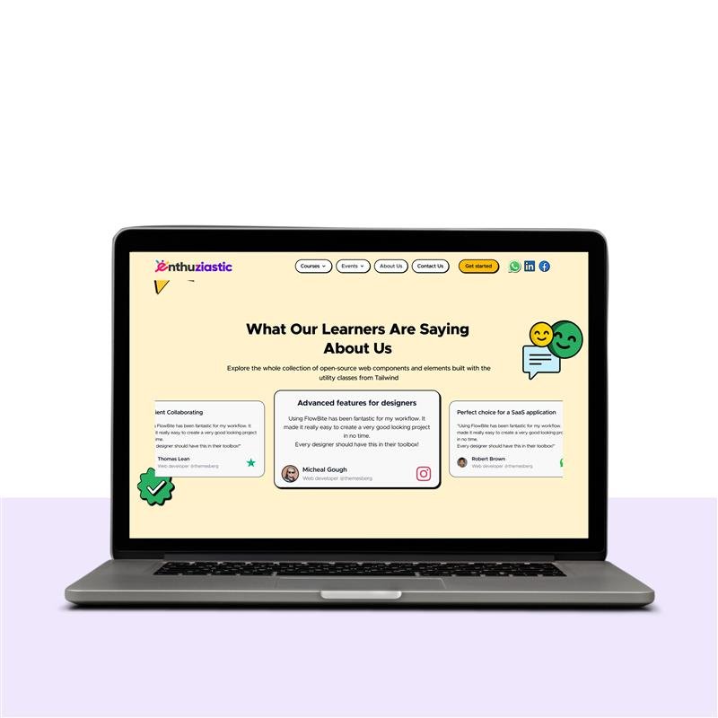
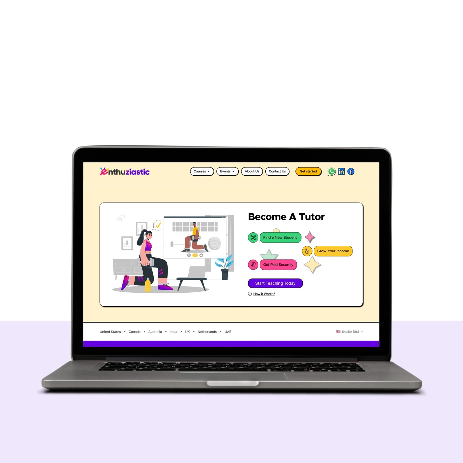
Final Design (New Enthuziastic Home Page)
Results & Impact
Hypothetical Metrics:
- Faster navigation compared to previous UI (user testing).
- Higher session bookings.
Lessons Learned
- Consistency is key: Uniform card designs improved usability.
- Trust elements matter: Testimonials with faces and roles increased conversions.
- Whitespace enhances clarity: Reduced cognitive load in course listings.
Project Gallery