
Membership UI
Company
Enthuziastic
Role
UI/UX (Product) Designer
Platform
Responsive Web
Design Team Size
1
Responsibility
From Scratch to Final UI till it Implement
Tools Used
Figma
The Problems
Before introducing the Membership UI, EnthuZiastic’s sales team had to manually convince users to purchase individual courses and apply discounts or offers. This process was time-consuming, inconsistent, and heavily dependent on sales bandwidth. It also made it difficult to scale or offer personalized deals. As a result, user experience was fragmented and conversion rates varied significantly.
Goals
- Reduce manual efforts by the sales team.
- Introduce a seamless, transparent self-service model for users.
- Offer tiered value to encourage course engagement and upsell opportunities.
- Increase overall sales and memberships.
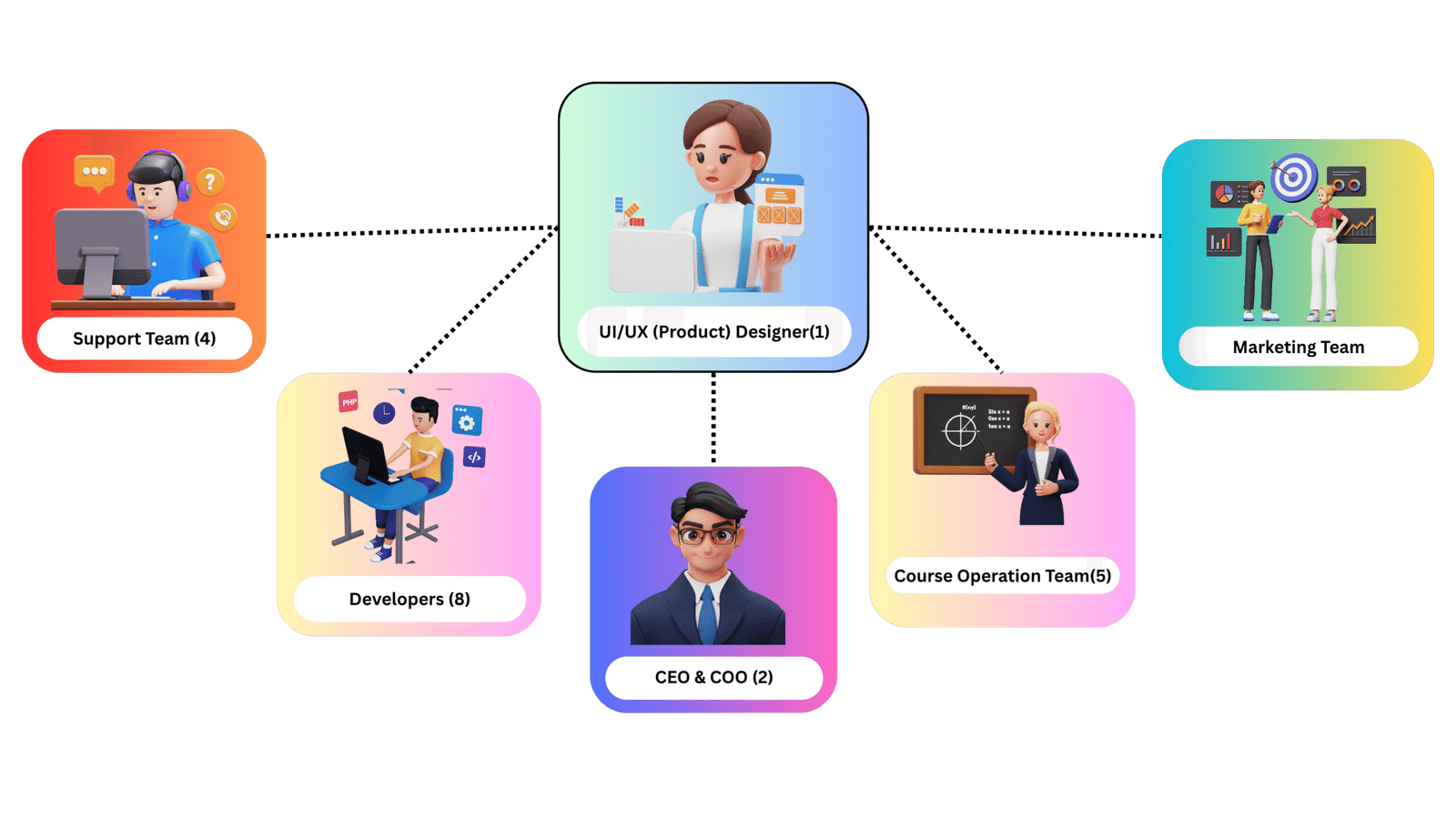
The Team
I led the design solo, collaborating closely with CEO, Developers, Marketing team, Course operation team, and Support team It was a tight, agile setup that enabled quick iterations and seamless execution.
The Process
I followed a user-centered design thinking process, focusing on understanding users’ pain points and business needs. My goal was to create a solution that balanced usability, business value, and technical feasibility through continuous feedback loops and iteration.
Key Steps
1. Identify Business Pain Points & Sales Friction: I began by collaborating with the sales, operations, and marketing teams to uncover key challenges in the current system:
- Sales reps were manually explaining plans, applying discounts, and chasing follow-ups.
- There was no centralized place for users to view or purchase bundled offerings.
- Users had inconsistent experiences, leading to confusion and dropped conversions.
This clarified the need for a transparent membership interface.
2. UX Research: With internal insights and competitor analysis, I uncovered key user and business needs.
- Users wanted clear pricing and benefits without needing to contact sales.
- Lack of transparency was causing confusion and drop-offs.
- Sales team needed an automated solution to reduce manual follow-ups.
- Competitor models showed that tiered plans and trust signals improved conversions.
3. Defining UX Goals (Set Clear Objective): My aim was to create a seamless, self-serve membership experience that supports both user confidence and business growth.
- Simplify plan selection with clear, side-by-side comparisons.
- Build trust through transparent pricing, benefits, and policies.
- Minimize user friction by reducing clicks and decision fatigue.
- Design for responsiveness across all devices.
- Encourage upgrades and trials through visual hierarchy and CTAs.
- Reduce dependency on the sales team with intuitive, guided navigation.
4. Design & Iteration: I developed wireframes and designed a clean, engaging interface which is aligned with brand guidelines. Created interactive prototypes, refining designs based on continuous feedback using Figma.
5. Handoff & Implementation Support: I delivered developer-ready specifications. ,With business input and competitor research, I established a clear strategy:
Solution
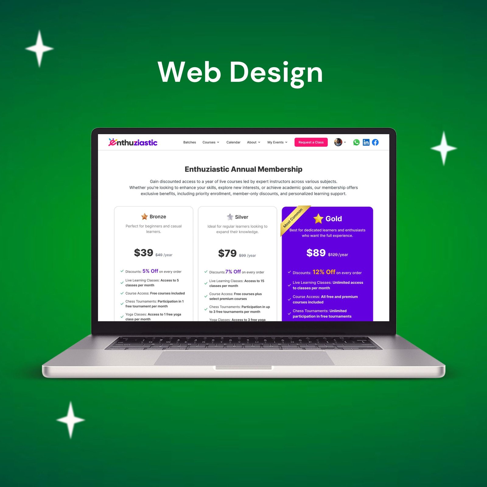
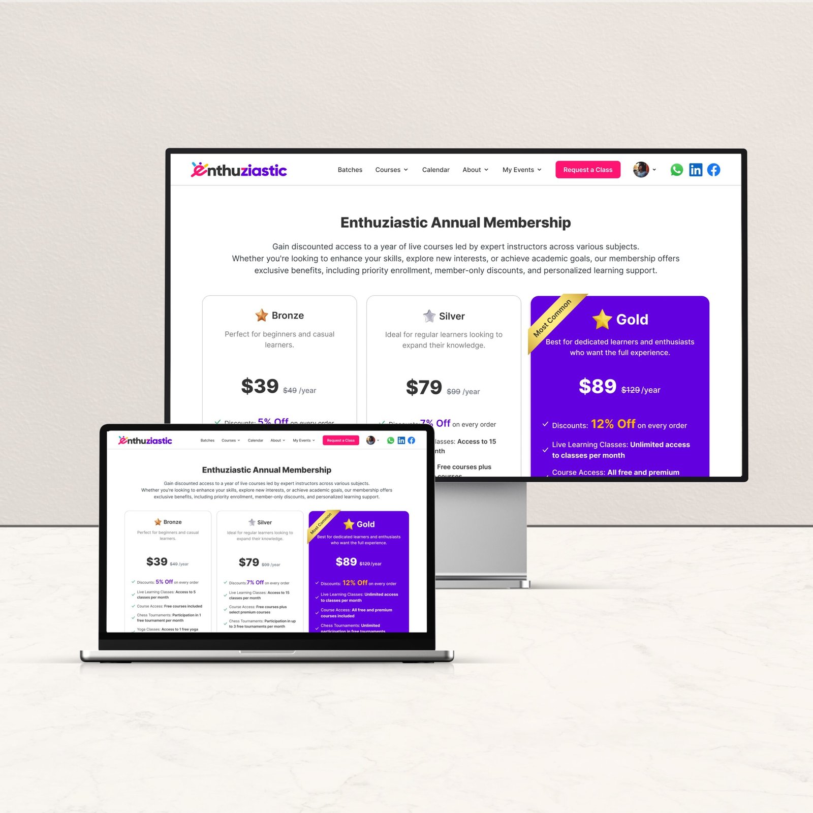
EnthuZiastic Annual Membership UI I designed a clean, conversion-focused to clearly present 3 tiered membership options:
- Bronze Plan
- Silver Plan
- Gold Pla
Final Design (Membership UI)
Business Impact
- Over 75% reduction in sales team follow-up calls.
- Sales members no longer need to manually apply discounts or explain course bundles.
- Users can now visually compare all plans and understand the value of each membership tier.
- Users feel empowered to make their own decisions and recognize the benefits of membership.
- 3x increase in course purchases via self-service membership options.
- Memberships contributed to a significant spike in retention.
- Gold plan adoption exceeded expectations, boosting high-value user engagement.
Design Highlights
- Clear pricing cards with visual hierarchy for easy comparison
- Tick-mark icons to emphasize features.
- Highlighted “Most Popular” tag for Gold plan.
- Mobile-responsive design with intuitive CTAs.
- Clean separation between features, pricing, and value proposition.
User Feedback
- Users appreciated the clarity in offerings and felt more confident purchasing on their own.
- The value tiers helped users match learning goals with the right membership
- Users now feel they are getting more benefits at better prices compared to buying individual classes.